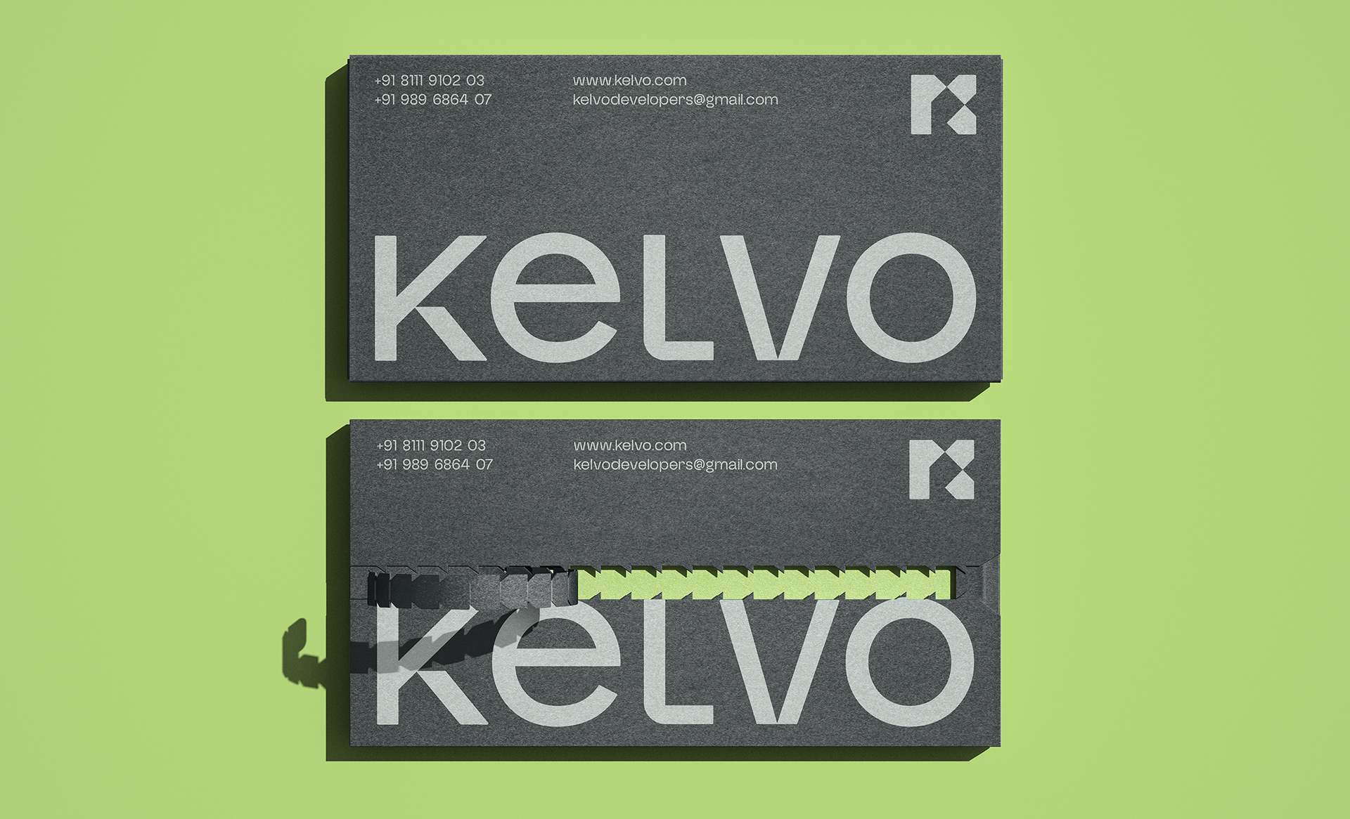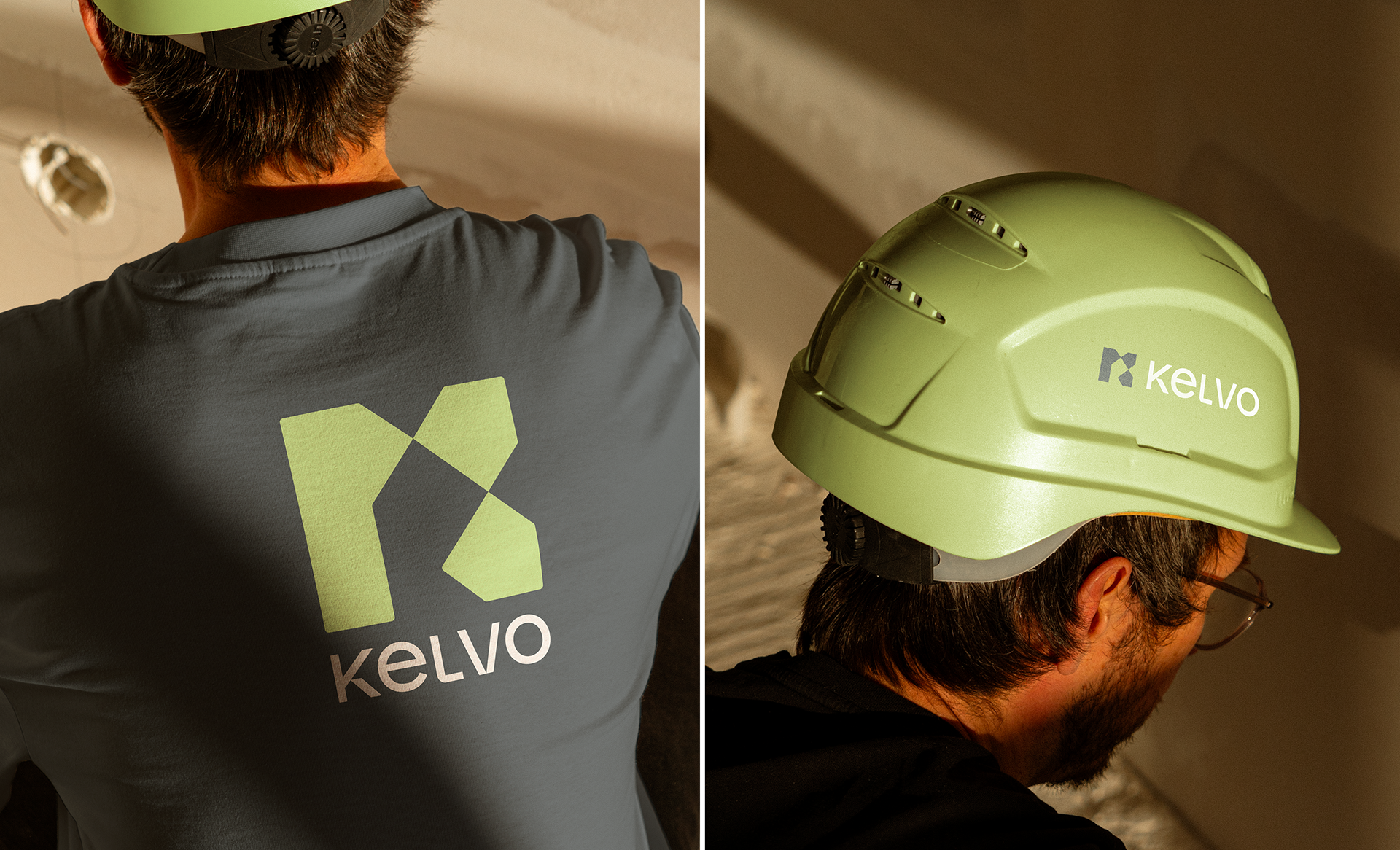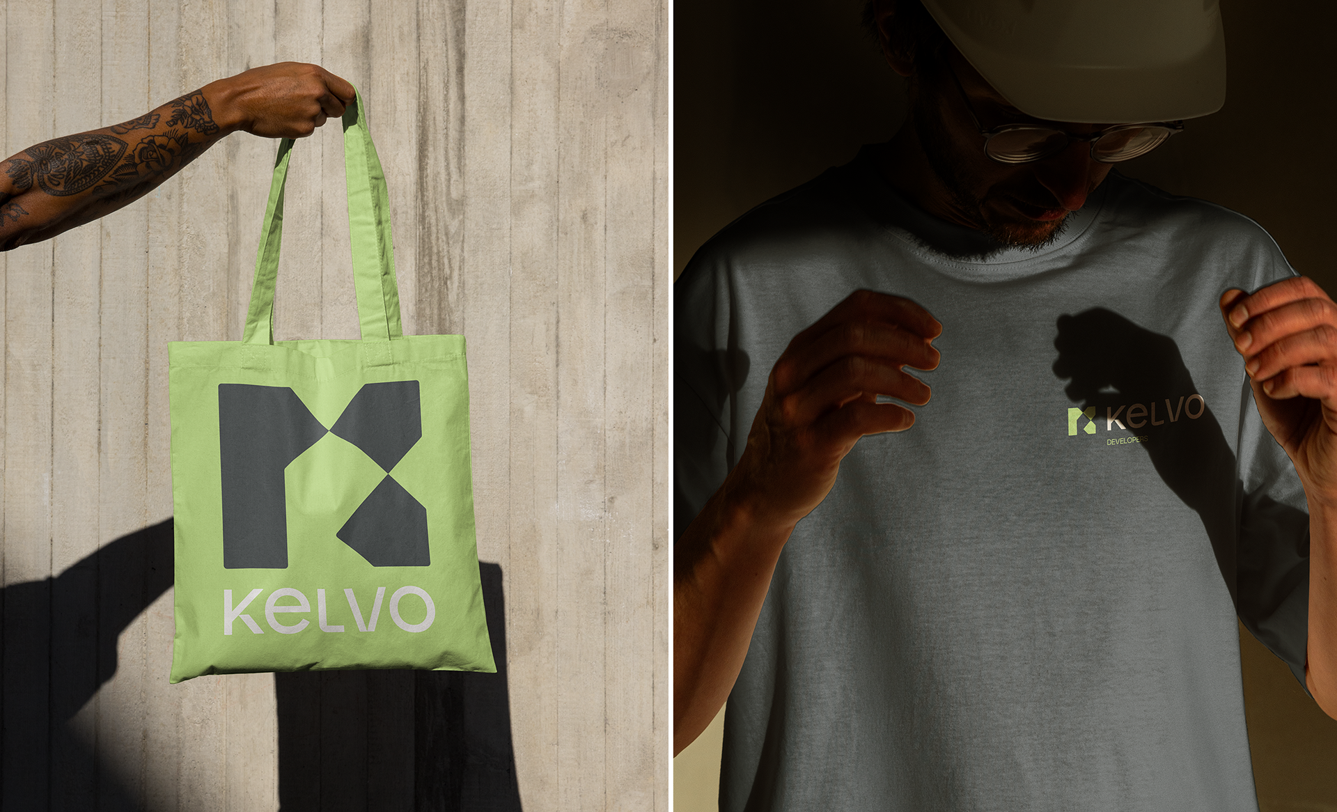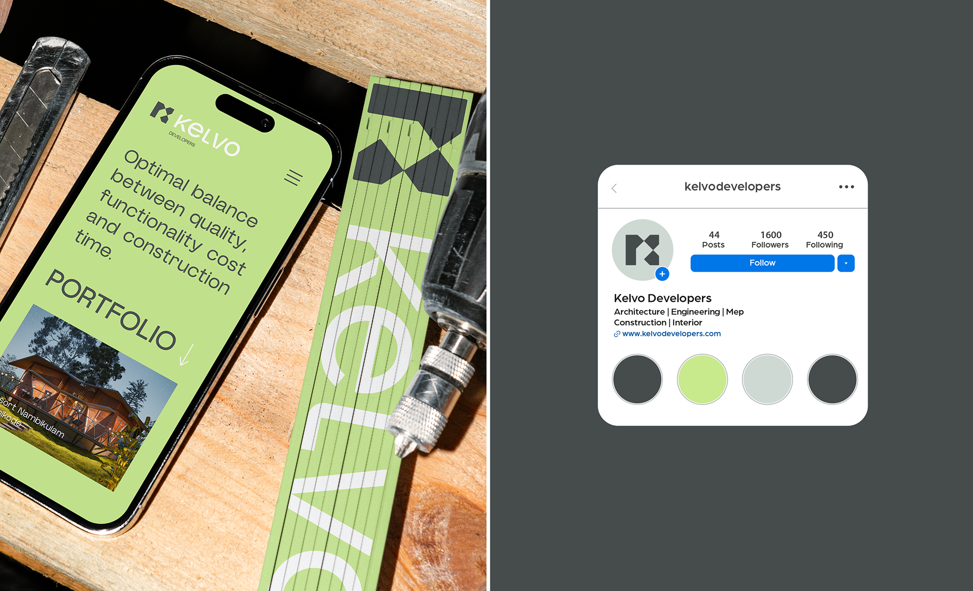


KELVO DEVELOPERS
Kelvo Developers is a construction and development company based in Kozhikode, India, specializing in residential, commercial, interior design, apartment, and villa projects. Although already operating in the market, the brand lacked a defined visual identity—and this was the starting point for the project.
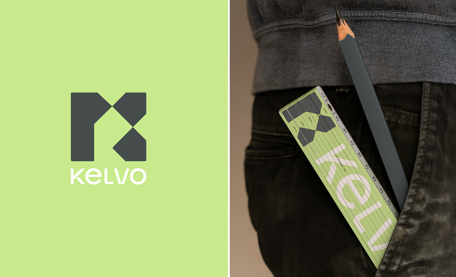
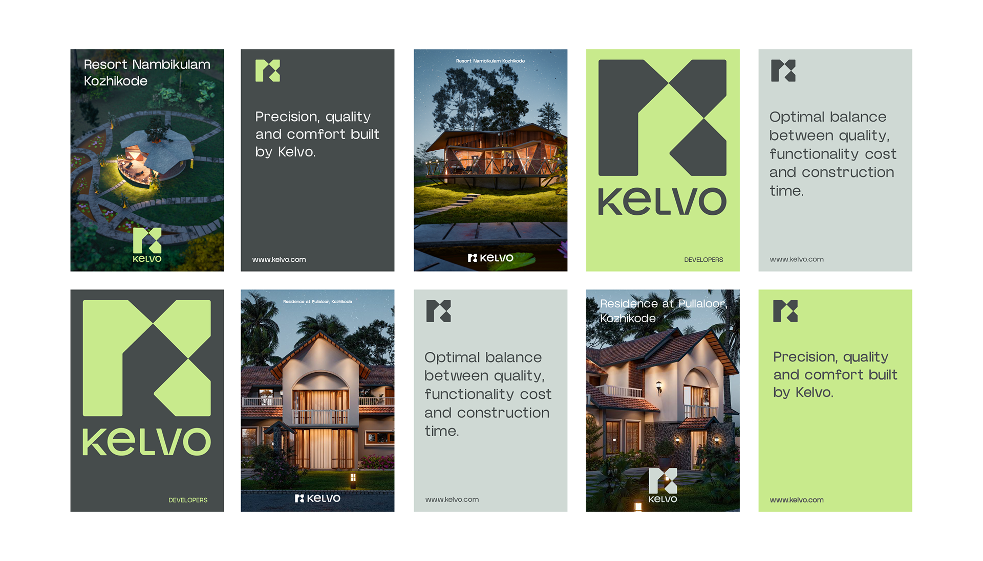
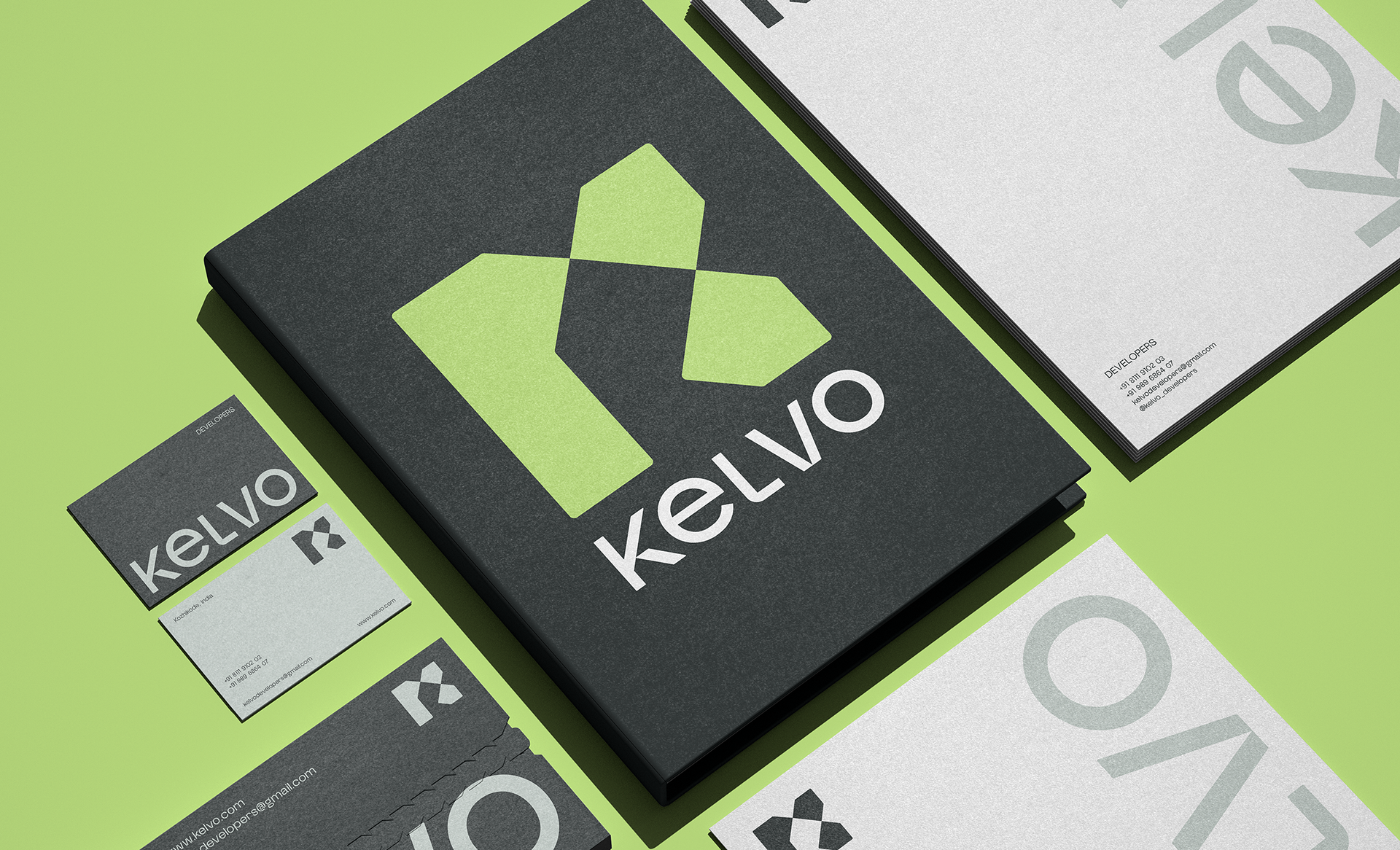
The challenge was to create an identity that conveyed the essence of the company, strengthening the connection with its customers while also clarifying its field of activity. To achieve this, a comprehensive visual solution was developed, ranging from the symbol to the typography, color palette, and supporting graphic elements.
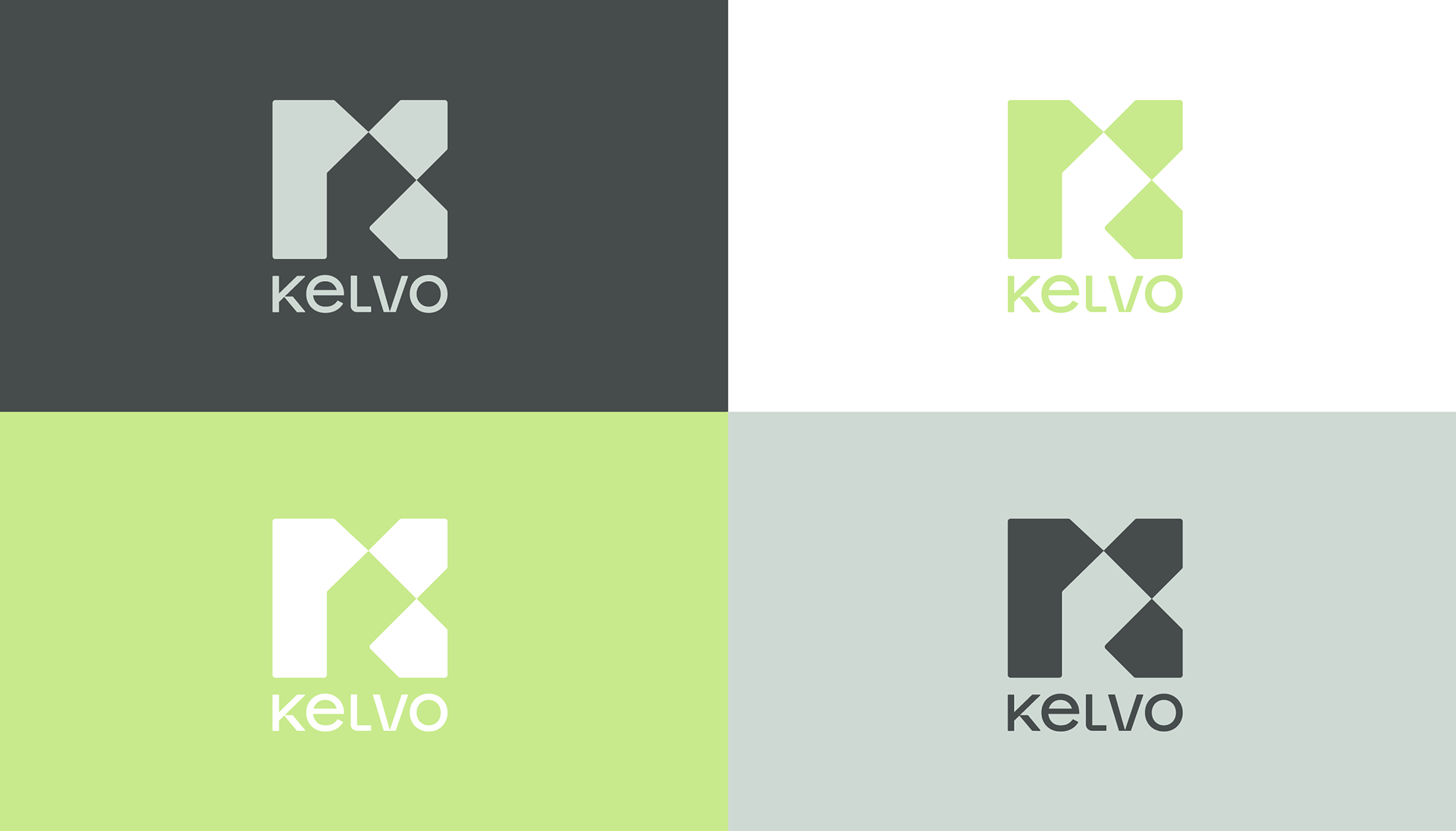
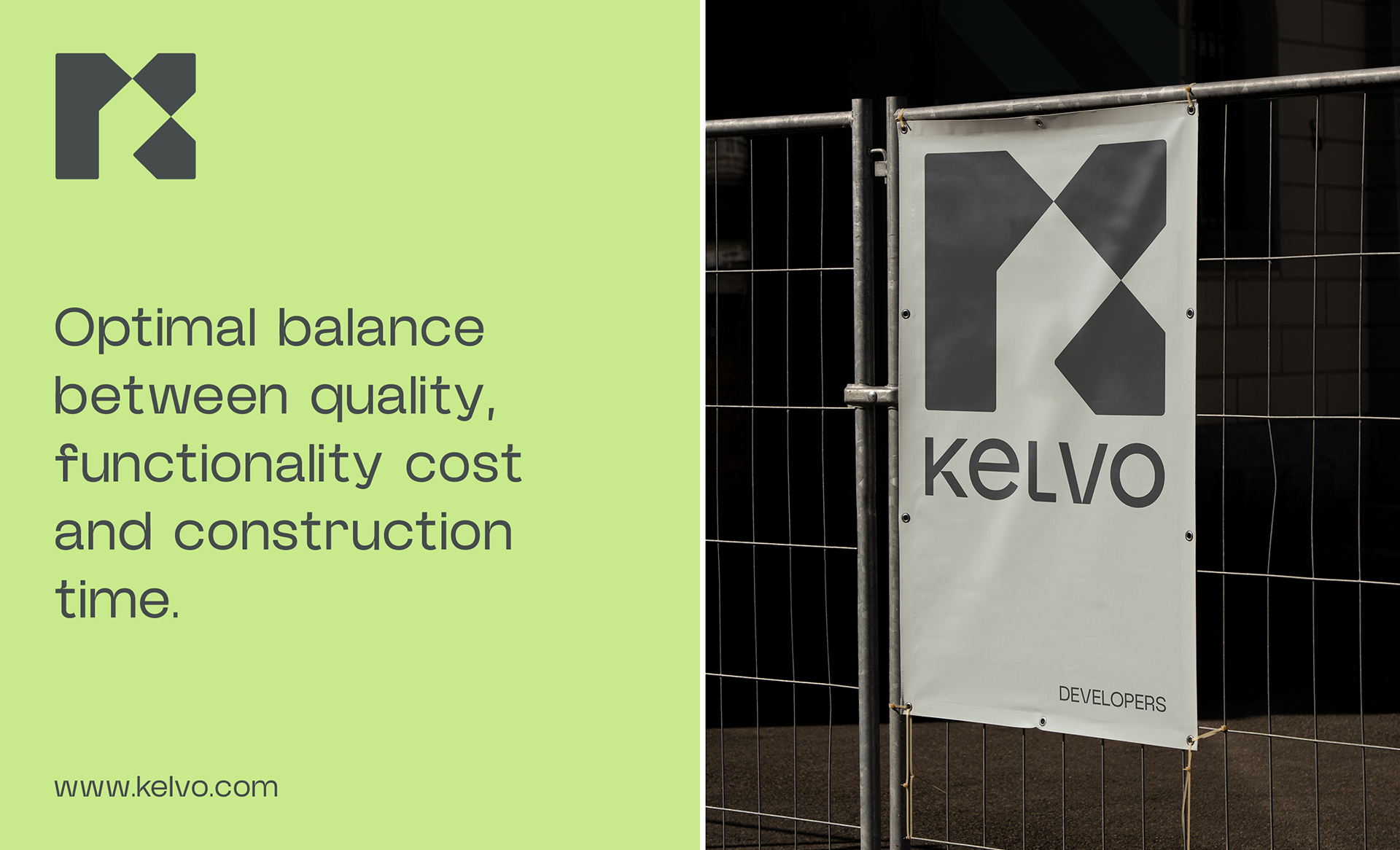
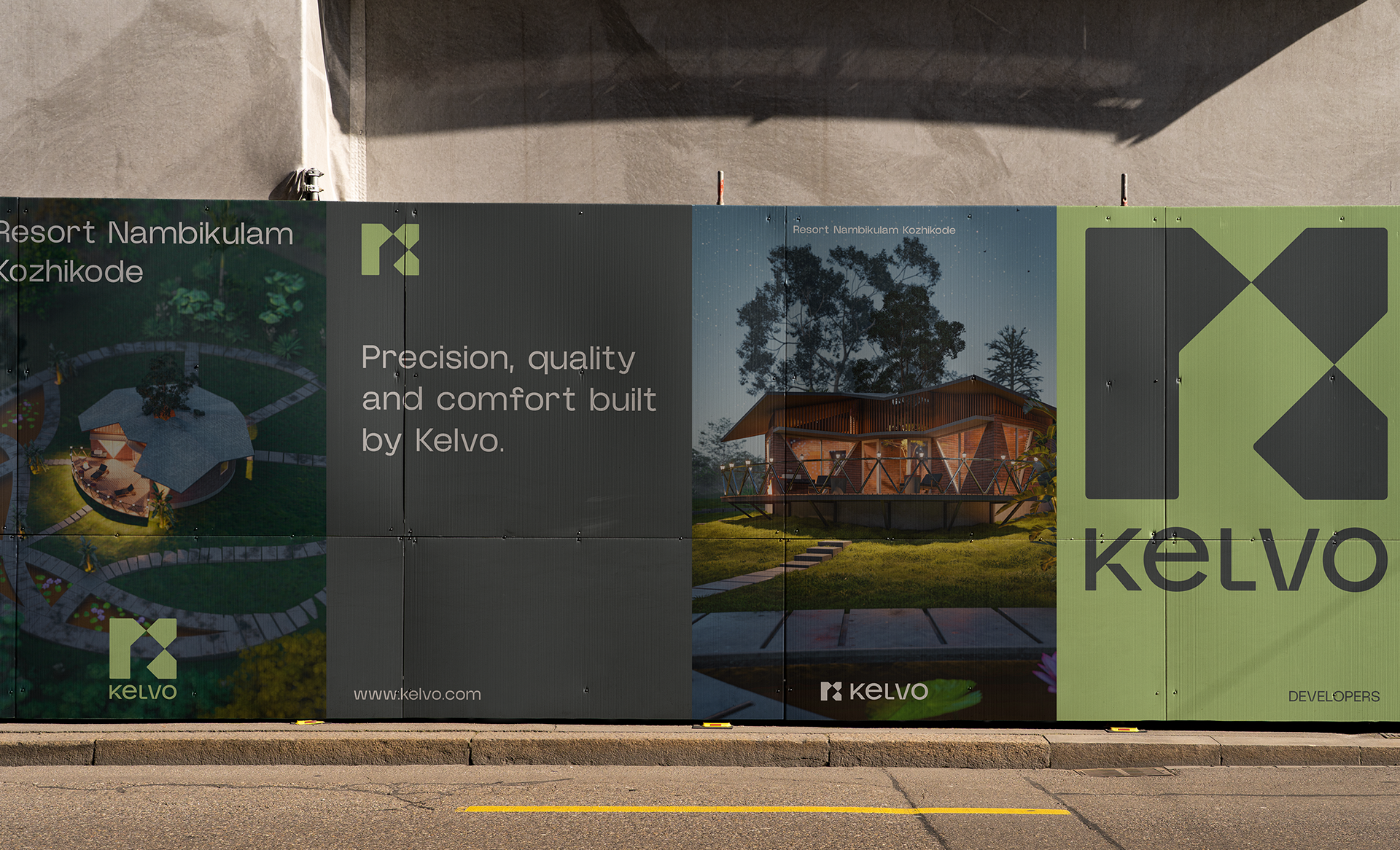
The symbol is born from the fusion of three pillars that represent the brand:
House and building shapes, which reflect the core of the business – engineering, architecture, and construction.
Directional arrows, which communicate dynamism, growth, and efficiency, reflecting agility in deadlines and quality in deliveries.
The initial "K," which personalizes the brand and gives it a unique visual signature.
The union of these elements resulted in a solid and contemporary symbol. The straight lines and precise angles evoke the technique and precision of engineering, while the geometric intersections convey structure, planning, and innovation.
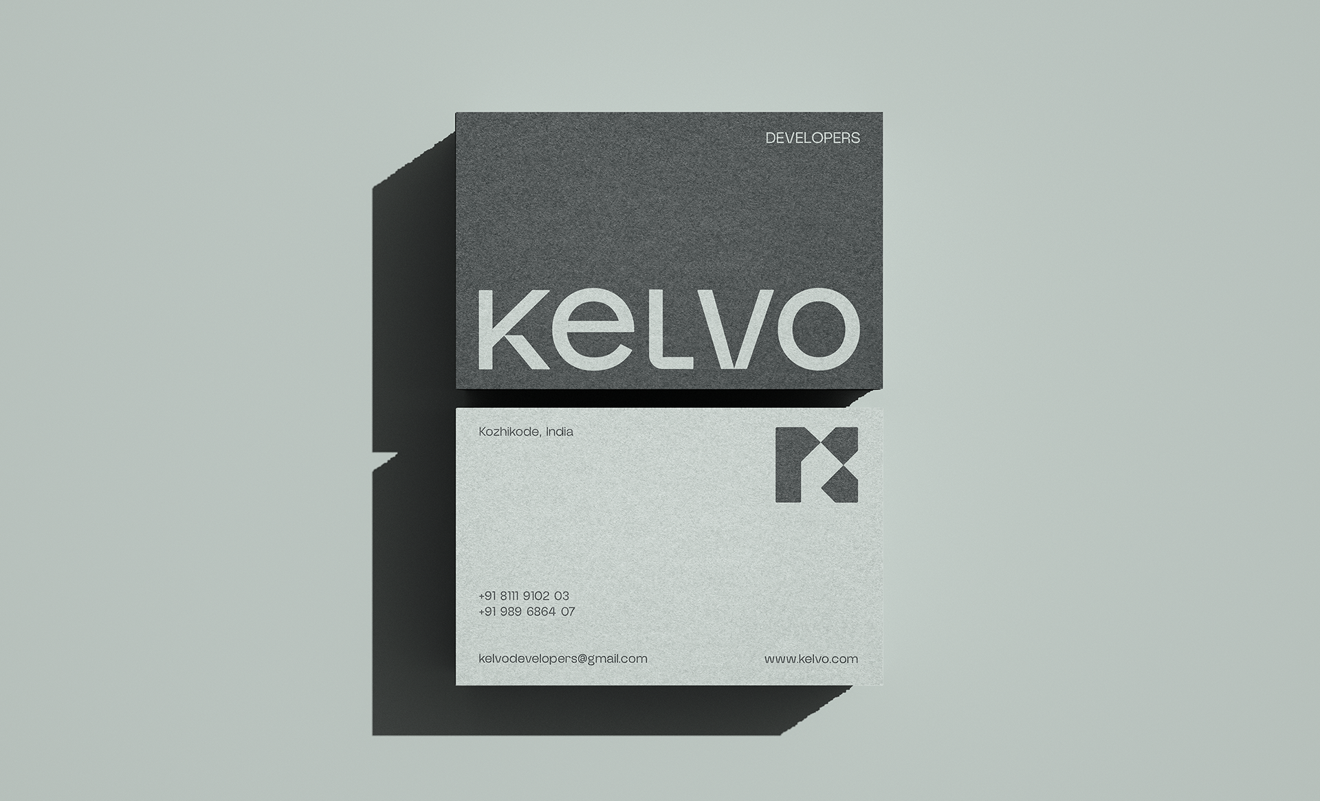
Subtle adjustments were made to the typography, reinforcing the brand's core attributes: quality, comfort, and exclusivity. Details such as the construction present in the letter "K" – which evokes an exposed roof – and the elongated base of the "L" complement the identity, connecting the logo to the world of construction.
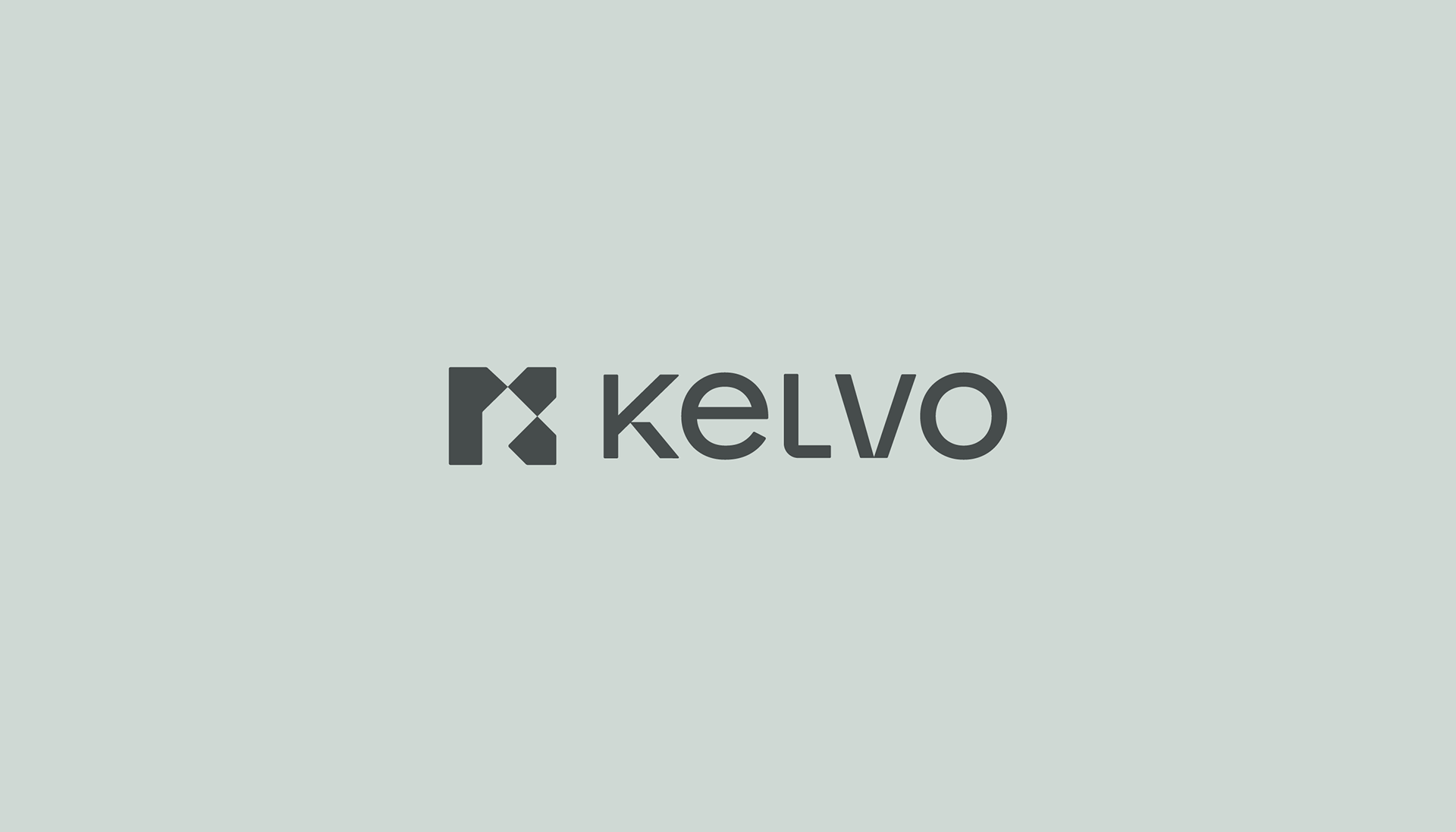
The result is a brand that balances solidity and reliability with creativity and forward-thinking vision, positioning Kelvo Developers as a company capable of transforming projects into reality in a unique and innovative way.